HURRICANE & CO
I worked closely with Beth to bring the heart of Hurricane & Co. to life, building a brand identity around her personal journey, her deep love for country music, and her natural creative spark.
The brand began when she hand-painted matching denim jackets for a country concert, and quickly evolved into a vision for bespoke, wearable art that blends western grit with an elevated feel.

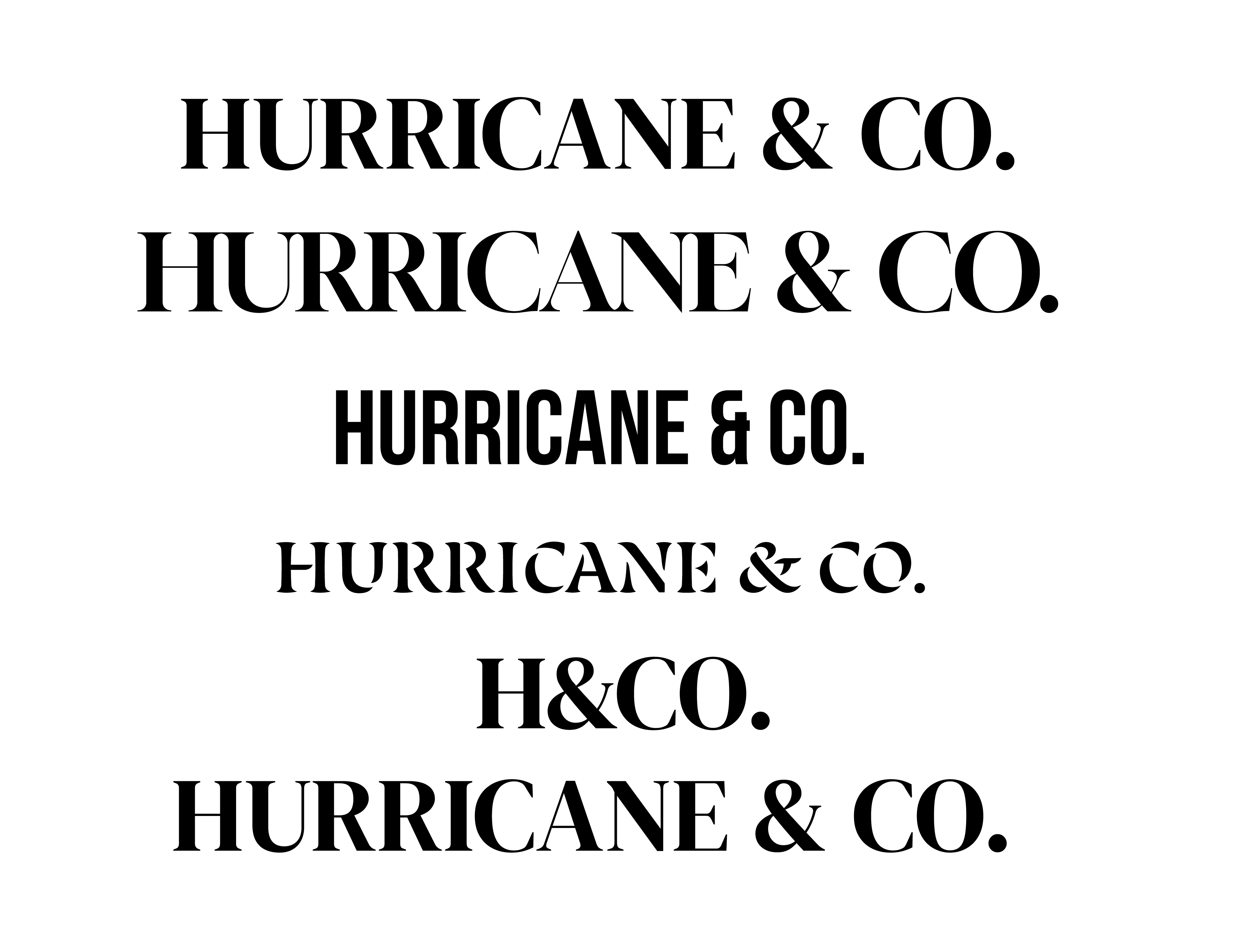
Beth (owner) came to me with the name Hurricane & Co. locked in, so my job was to build a brand mark that felt truly western without falling into tired tropes like cheesy cowboy fonts or cliché boot illustrations.
Part of my design process is always exploring the obvious ideas first to see where they lead. I started by looking at western typography and experimented with hiding subtle boot silhouettes inside the letterform of the "H", but it quickly felt forced. From there, I explored saloon-door geometry, yet it ended up feeling flat, uninspired, and just a bit boring.

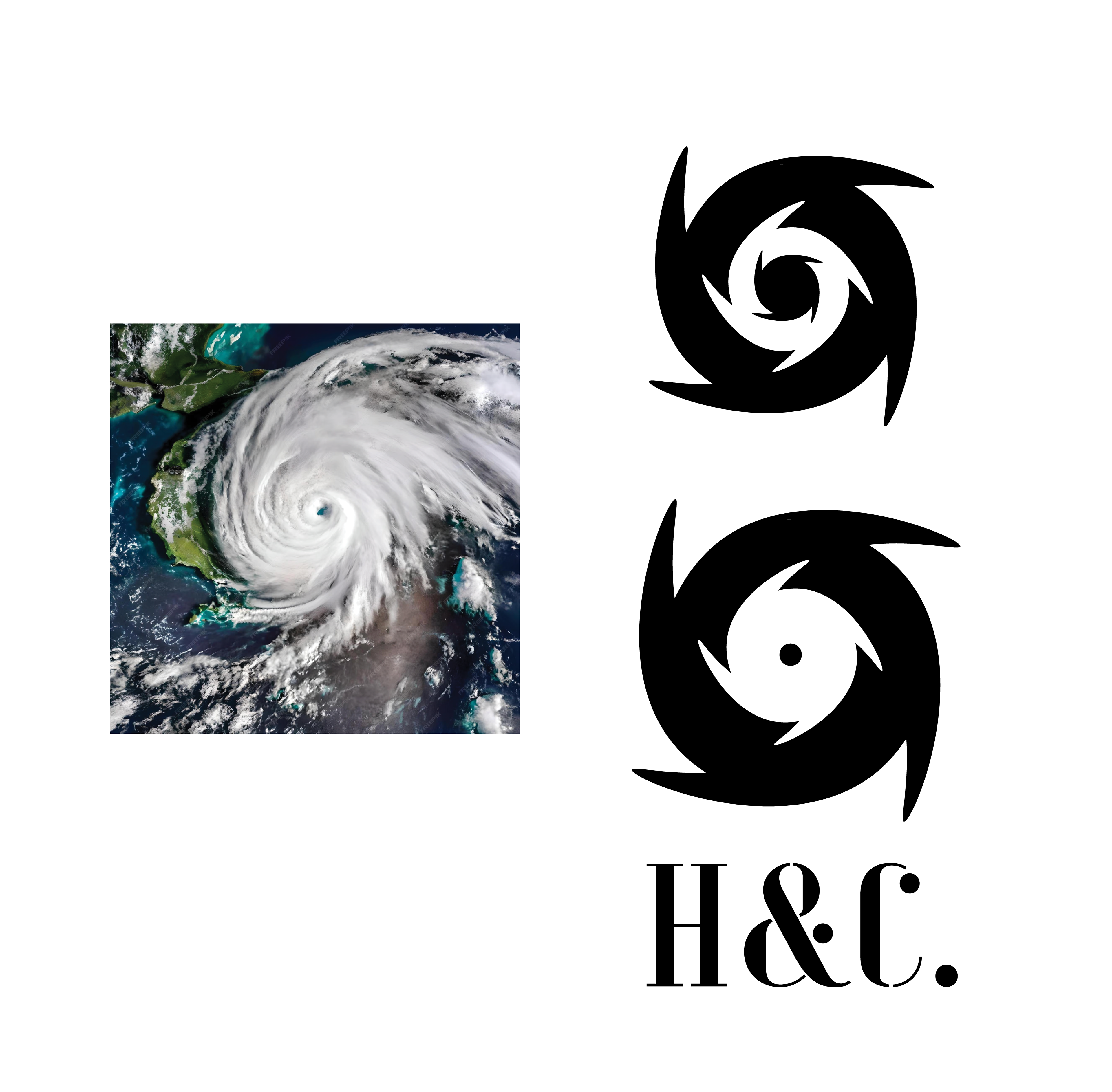

I decided to shift the focus entirely towards the storm itself. I started dissecting the physical anatomy of a hurricane, isolating tailwind curves and creating a sense of motion where one tail chased the other around the centre.


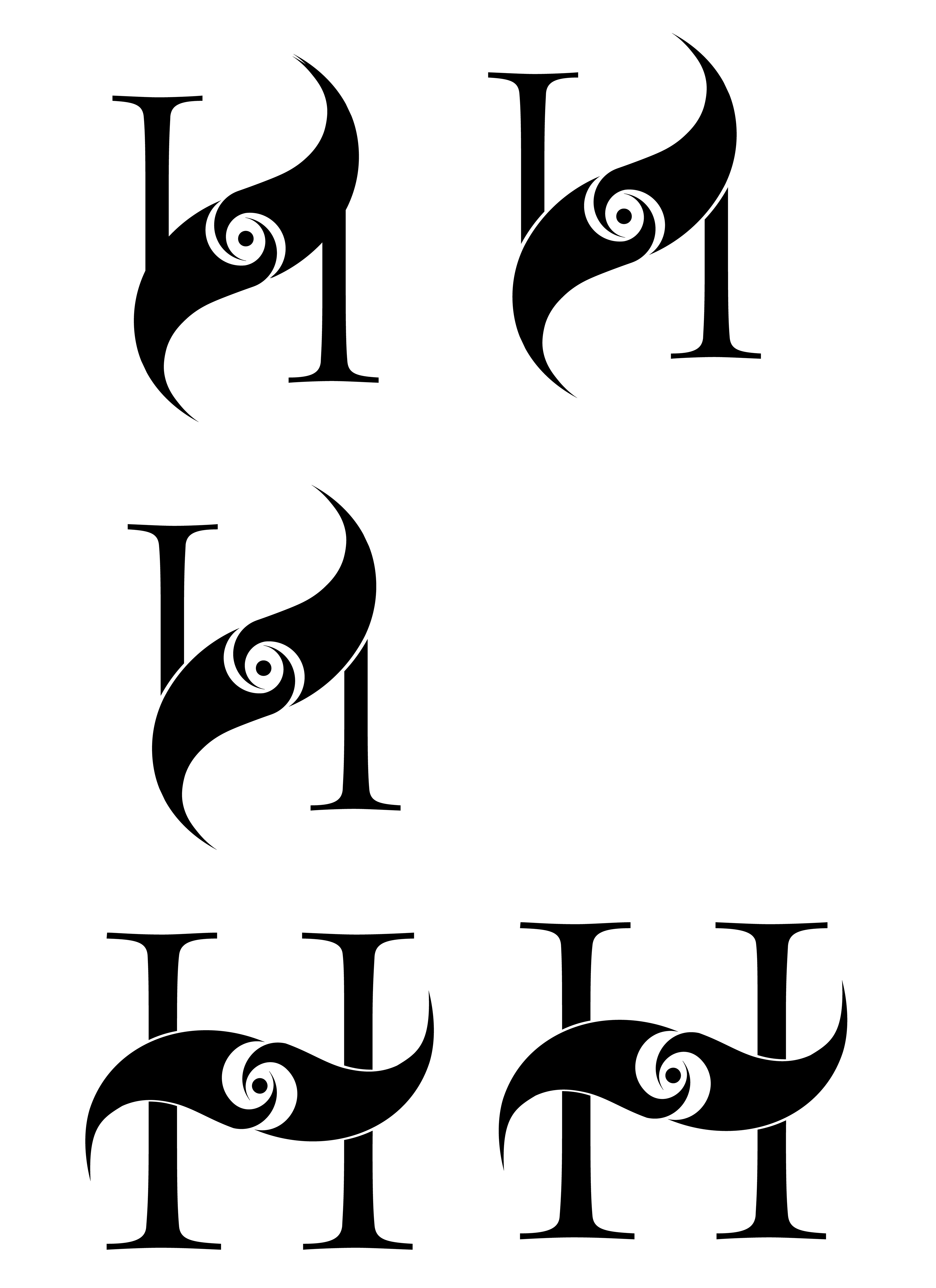

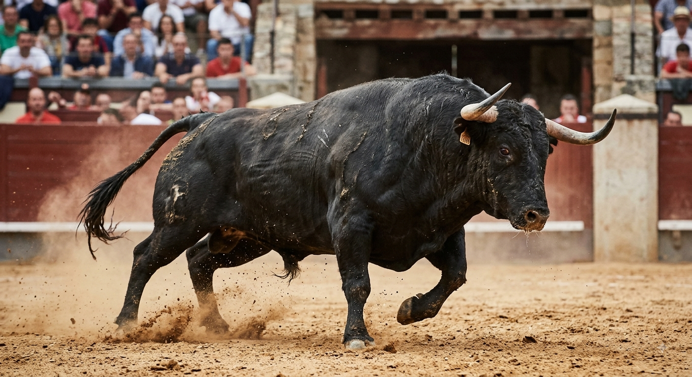
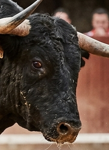
To give that circular motion a distinct, western edge, I looked at the shape of a bull's eye rather than a generic circle. Blending the sharp, focused profile of a bull's eye with the dynamic tailwinds gave the storm's centre the exact attitude I was looking for.
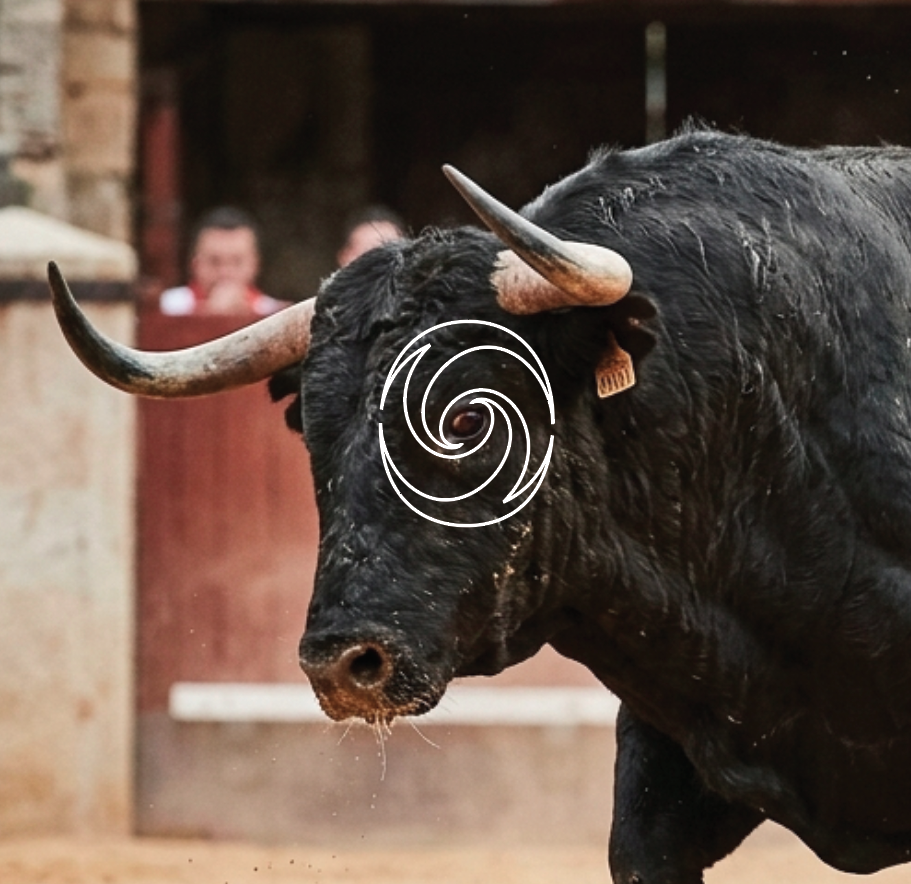
When testing the initial mark against Beth's brand colour palette, the layout felt slightly too open and lost some of its impact. I introduced fine, sweeping line work to tighten the structure and exaggerate the circular chase of the winds.

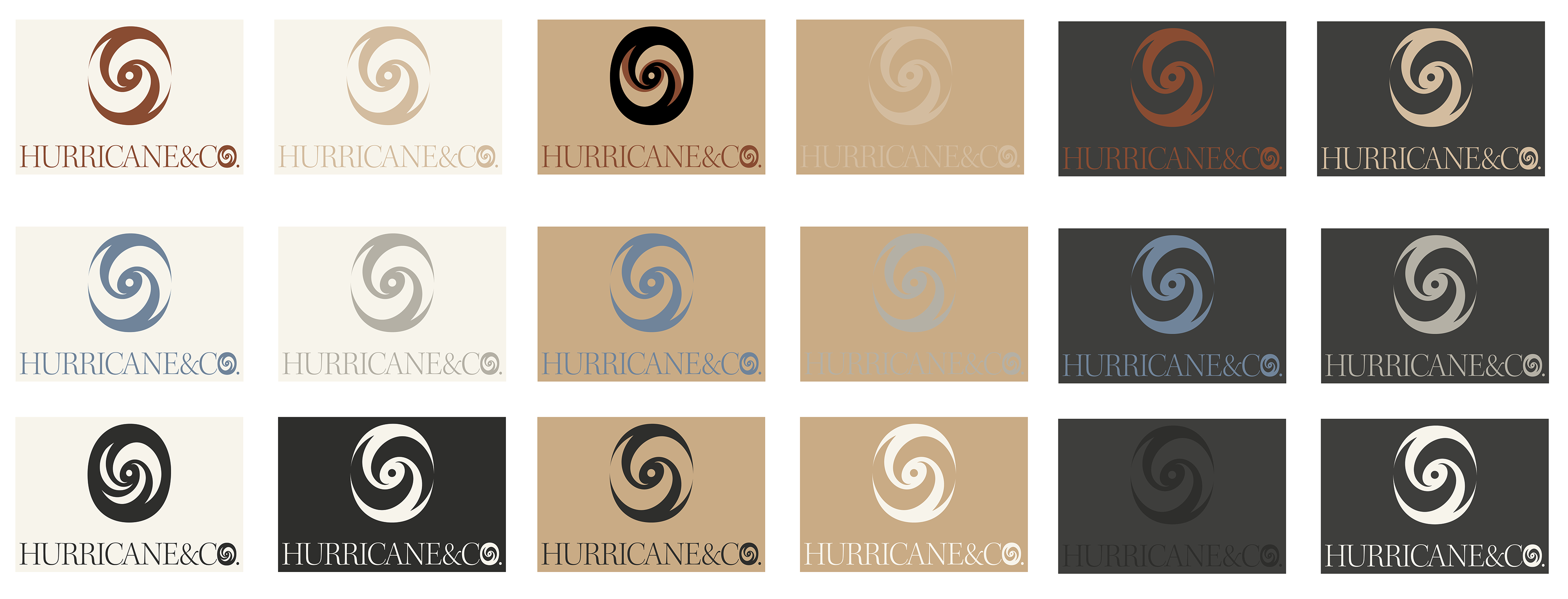

That final layer of detail locked the whole piece together, giving Beth a clean, intentional logo mark that balances storm energy with elevated western style.
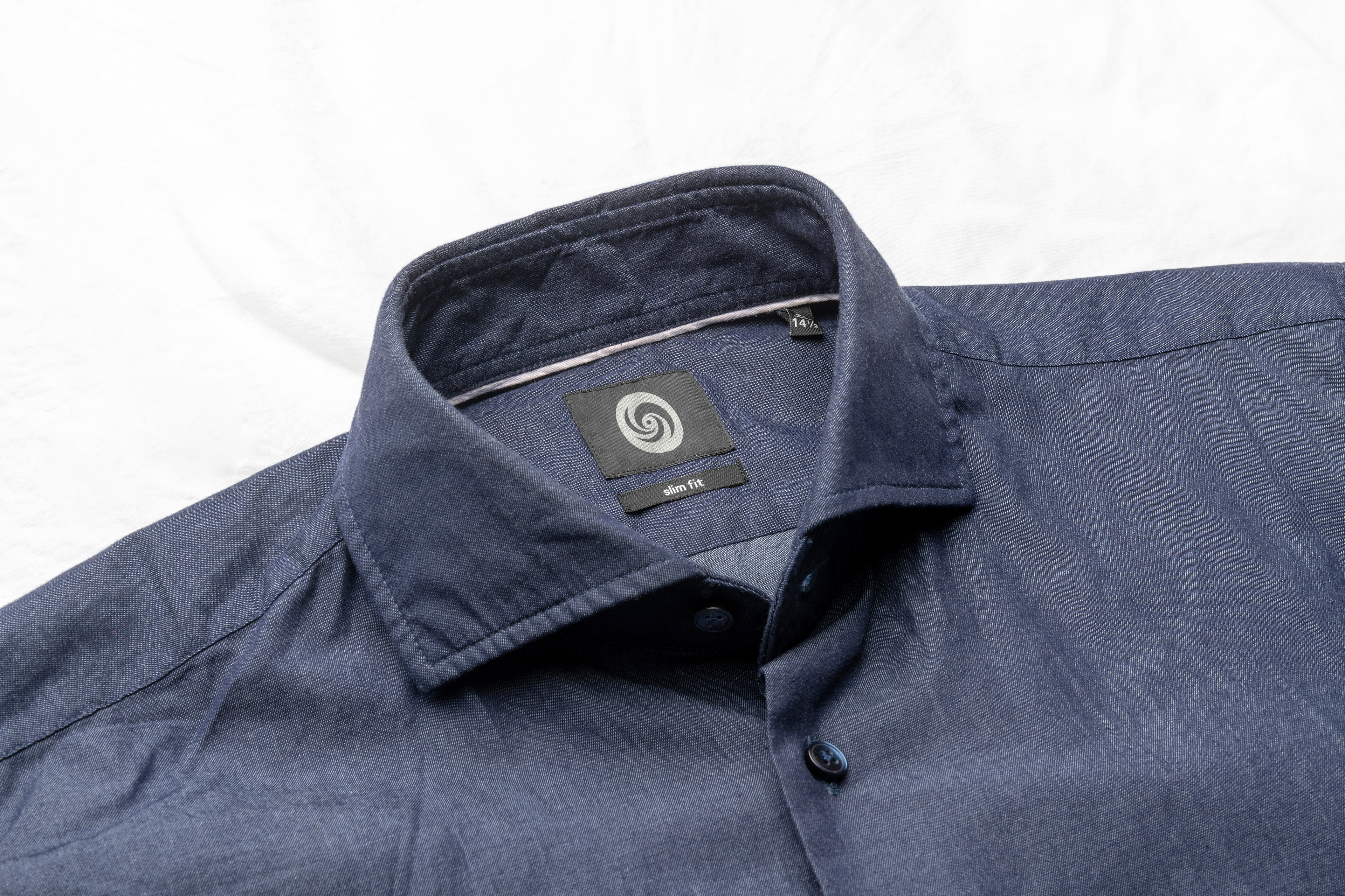
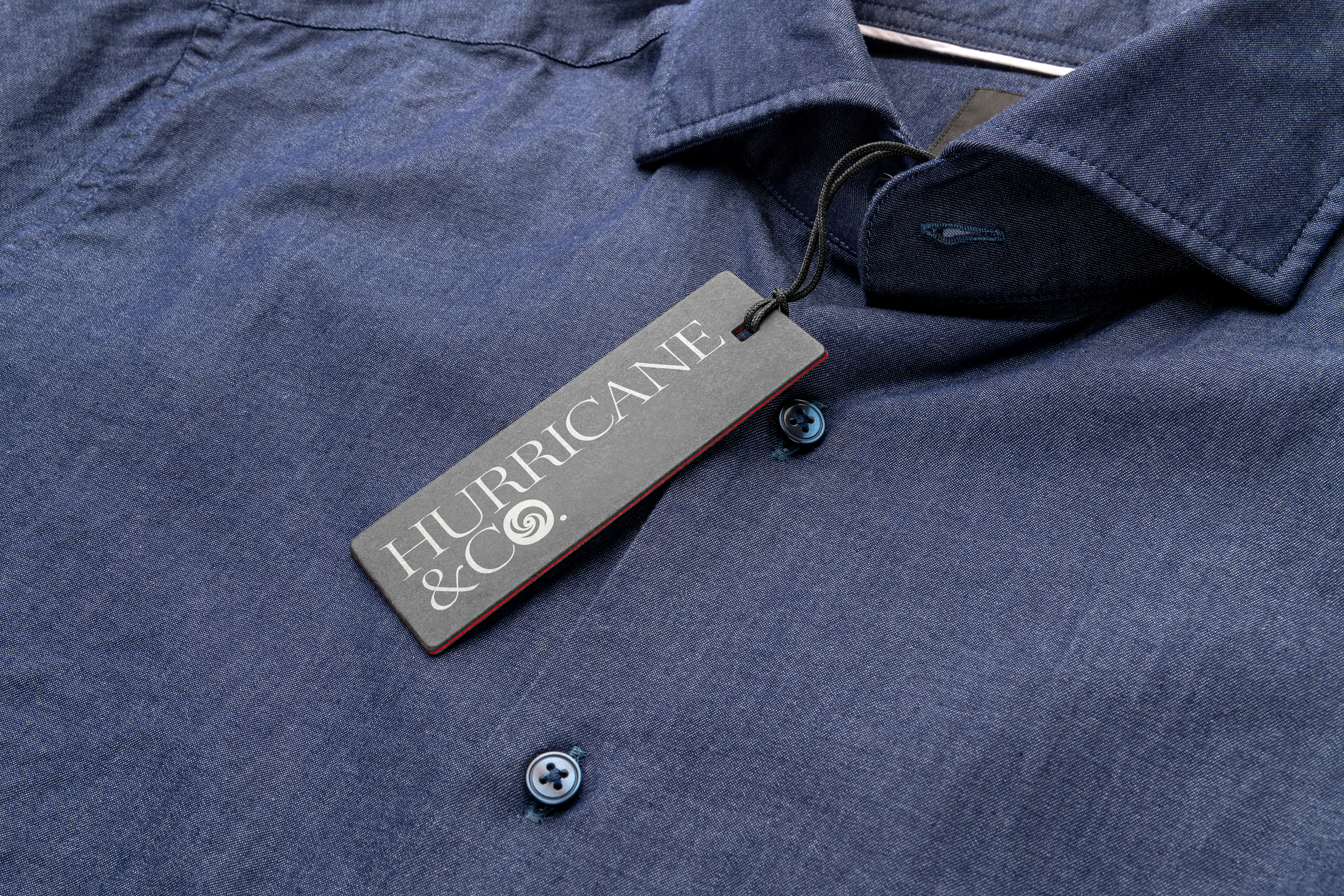
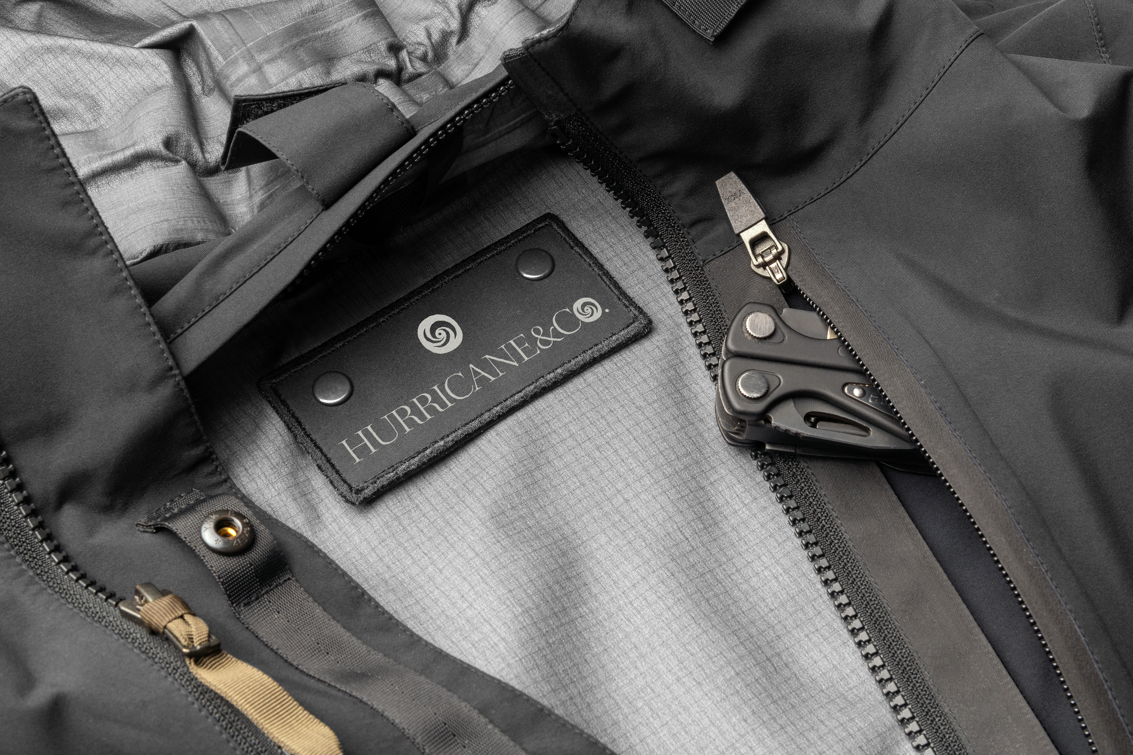
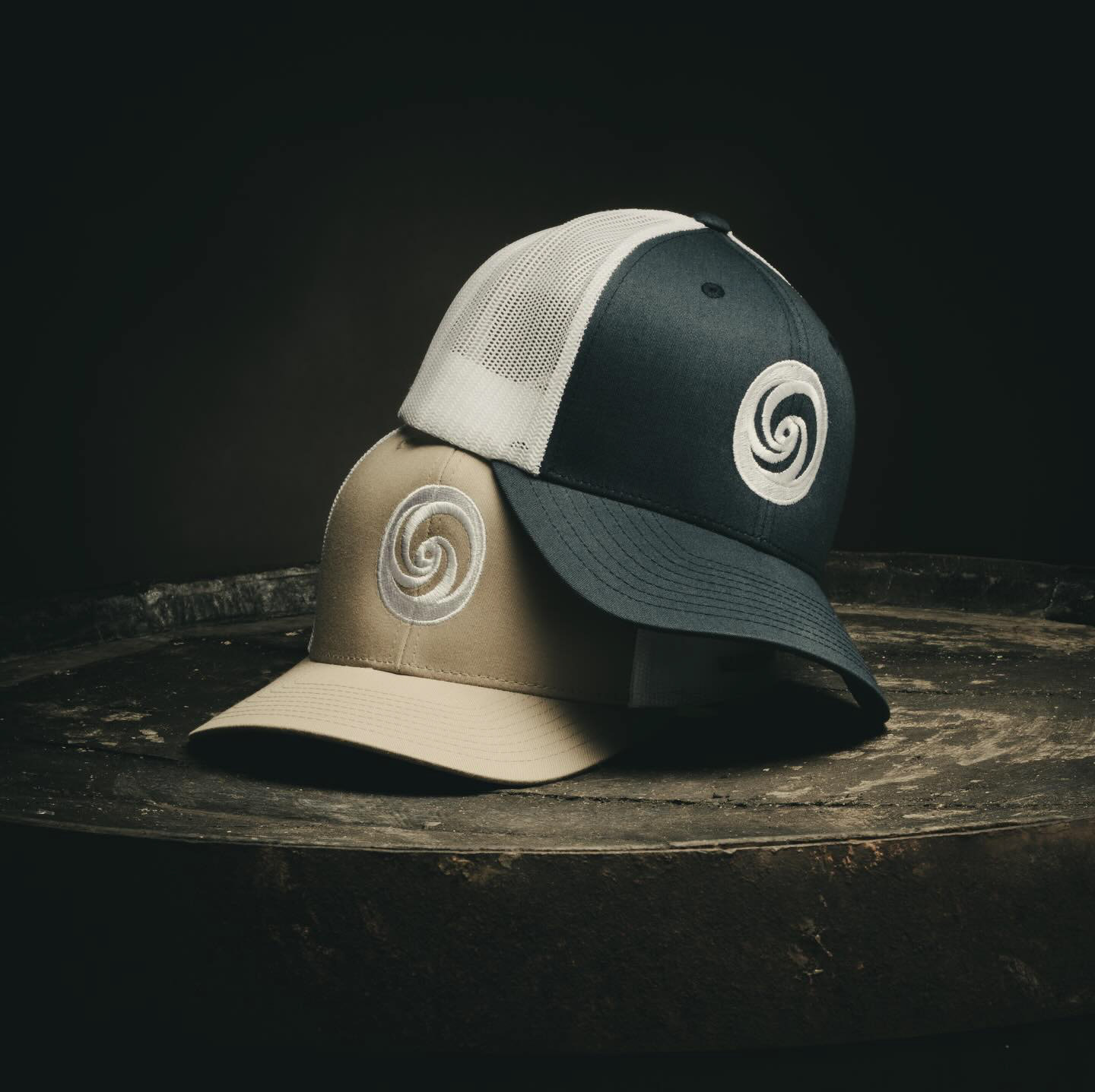
Below, you can see the final logo suite alongside a set of real-world mockups I created to showcase how the brand lives across denim apparel, custom tags, and digital touchpoints.