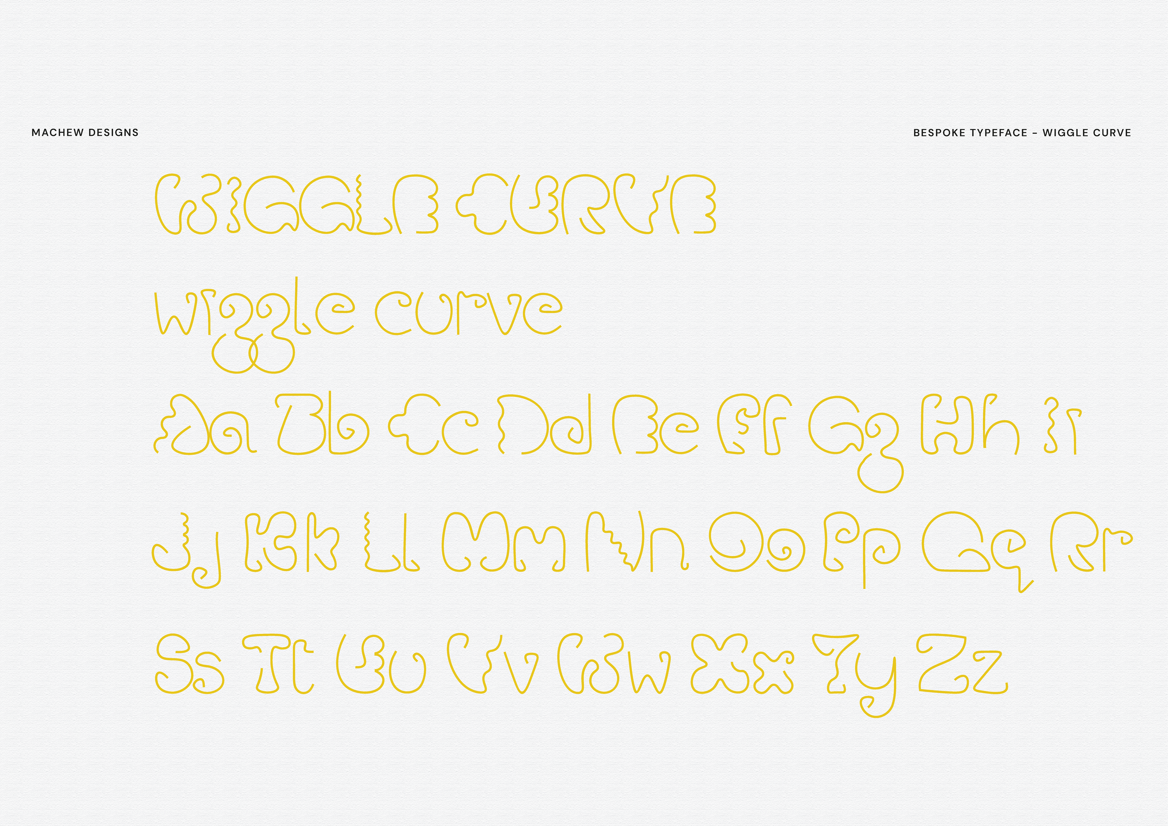
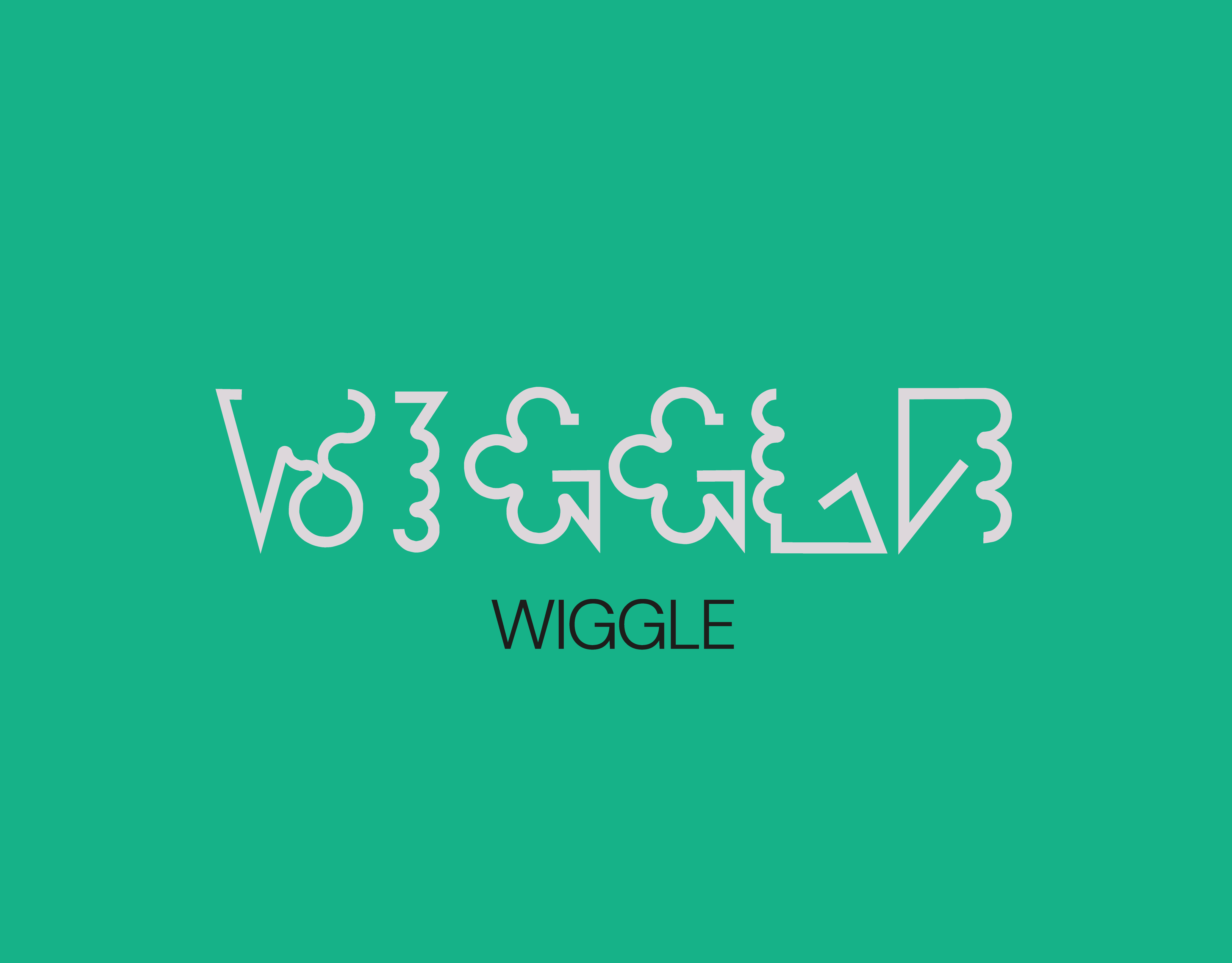
WIGGLE CURVE
Building upon the concept of Wiggle Sans, I developed new letterforms from a single continuous line, allowing distinct shapes to emerge and bringing greater legibility to the original wiggle. The idea was to retain the playful essence but introduce more movement and more wiggle.
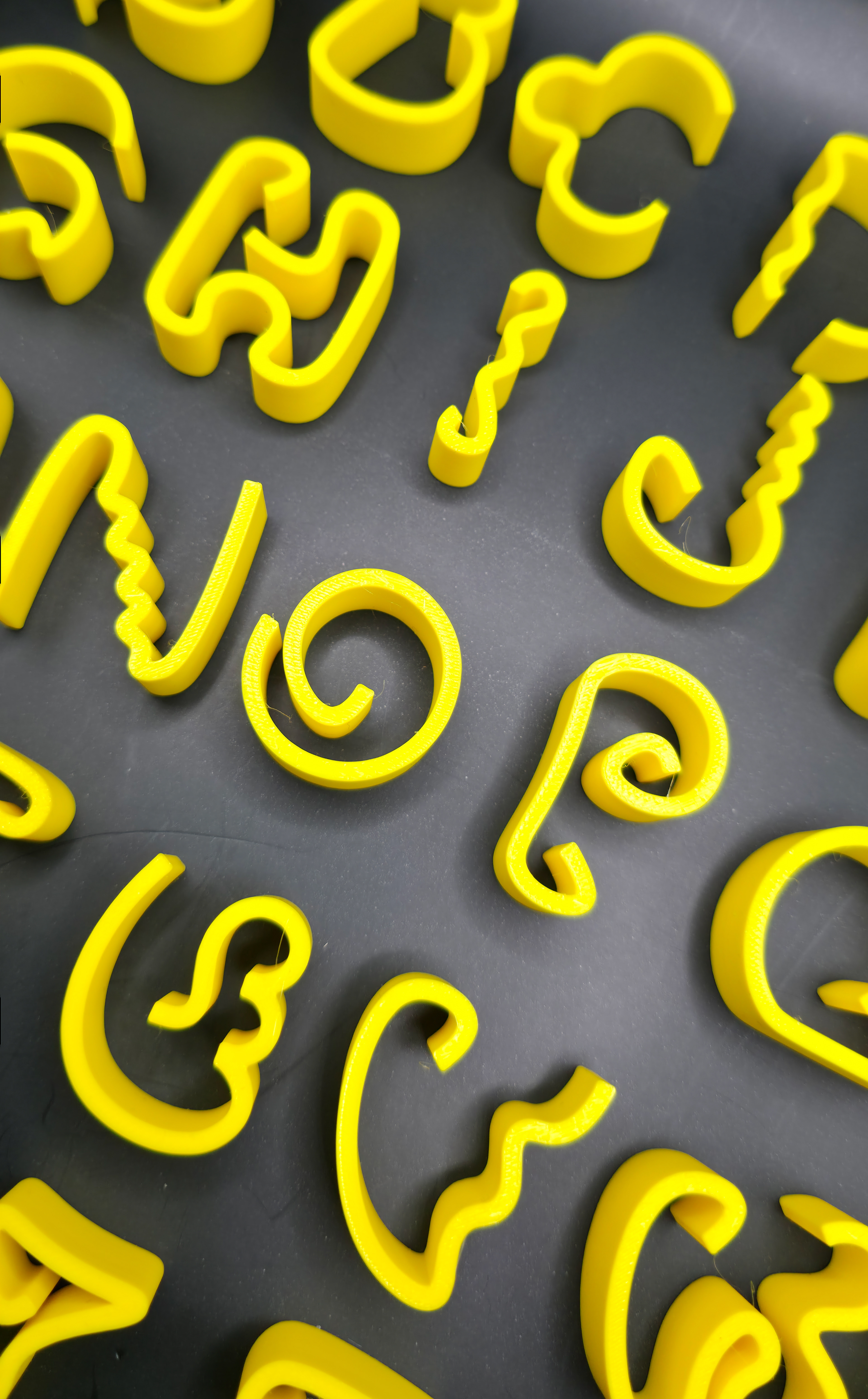
While the working title was Wigglemore, I chose a shorter and sharper name, Wiggle Curve, to reflect the increased curvature and flow. I then expanded the typeface into 3D prints, which turned out successfully and opened up new possibilities in form, texture, and application.